
2 Apr
2011
2 Apr
'11
11:35 a.m.
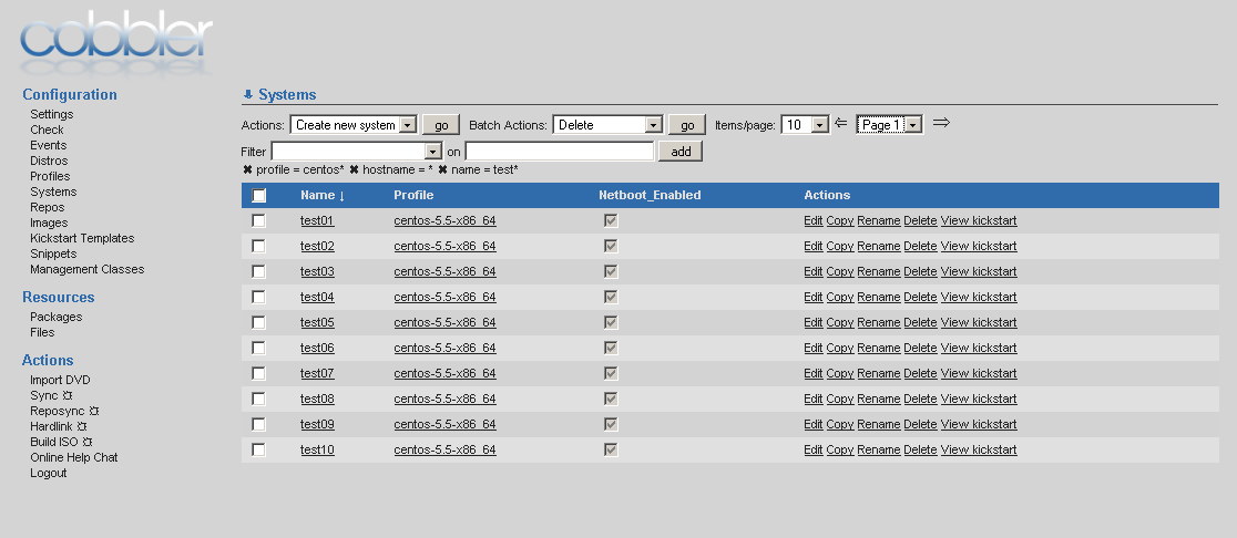
Here's my current iteration of the web UI layout, and I thought I'd ask for feedback before doing any commits.
In my mind, it made sense to have all this stuff at the top, rather than buried at the bottom left under the menu. I thought about moving it to a three column format, with the pagination/filter stuff on the right, but I didn't like it much better. I do think some of the actions might be ok for the right, but the filter stuff really should be at the top. I'm also considering moving the page controls to the bottom under the list.
Thoughts?