
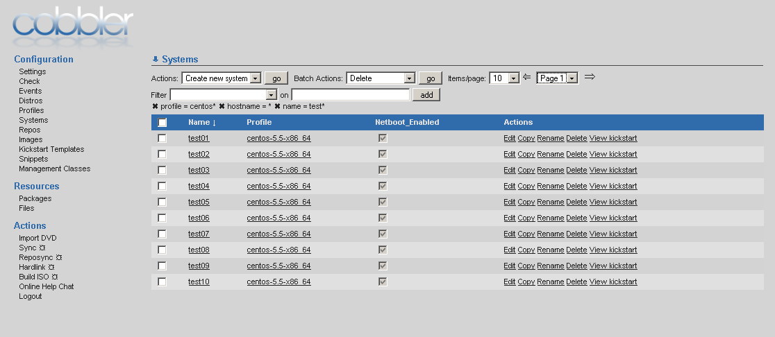
Here's my current iteration of the web UI layout, and I thought I'd ask for feedback before doing any commits.
In my mind, it made sense to have all this stuff at the top, rather than buried at the bottom left under the menu. I thought about moving it to a three column format, with the pagination/filter stuff on the right, but I didn't like it much better. I do think some of the actions might be ok for the right, but the filter stuff really should be at the top. I'm also considering moving the page controls to the bottom under the list.
Thoughts?

On 4/2/2011 2:35 PM, James Cammarata wrote:
In my mind, it made sense to have all this stuff at the top, rather than buried at the bottom left under the menu.
Much better!
I thought about moving it to a three column format, with the pagination/filter stuff on the right, but I didn't like it much better. I do think some of the actions might be ok for the right, but the filter stuff really should be at the top. I'm also considering moving the page controls to the bottom under the list.
I don't think three column is right for this. There does need to be some separation between the actions and the pagination. I don't have strong feelings about whether filters should go with actions or pagination. I prefer the filters on the top, so I think if you move pagination to the bottom, which seems a reasonable idea, filters should stay with actions.
-spp
I thought about moving it to a three column format, with the pagination/filter stuff on the right, but I didn't like it much better. I do think some of the actions might be ok for the right, but the filter stuff really should be at the top. I'm also considering moving the page controls to the bottom under the list.
I don't think three column is right for this. There does need to be some separation between the actions and the pagination. I don't have strong feelings about whether filters should go with actions or pagination. I prefer the filters on the top, so I think if you move pagination to the bottom, which seems a reasonable idea, filters should stay with actions.
Yeah, the more I look at it, the more I think the pagination stuff should be at the bottom.
On Sun, Apr 3, 2011 at 9:16 AM, James Cammarata jimi@sngx.net wrote:
I thought about moving it to a three column format, with the pagination/filter stuff on the right, but I didn't like it much better. I do think some of the actions might be ok for the right, but the filter stuff really should be at the top. I'm also considering moving the page controls to the bottom under the list.
I don't think three column is right for this. There does need to be some separation between the actions and the pagination. I don't have strong feelings about whether filters should go with actions or pagination. I prefer the filters on the top, so I think if you move pagination to the bottom, which seems a reasonable idea, filters should stay with actions.
Yeah, the more I look at it, the more I think the pagination stuff should be at the bottom.
The other thought I had was the "actions" column should be nixed and moved up into the new "actions" combo box. I'm debating that though, because the user would have to select one object and then select the action from the drop-down box... not sure if I like that. It would allow us to display more info about each object in the table though.

On Sun, Apr 3, 2011 at 10:06, James Cammarata jimi@sngx.net wrote:
On Sun, Apr 3, 2011 at 9:16 AM, James Cammarata jimi@sngx.net wrote:
I thought about moving it to a three column format, with the pagination/filter stuff on the right, but I didn't like it much better. I do think some of the actions might be ok for the right, but the filter stuff really should be at the top. I'm also considering moving the page controls to the bottom under the list.
I don't think three column is right for this. There does need to be some separation between the actions and the pagination. I don't have strong feelings about whether filters should go with actions or pagination. I prefer the filters on the top, so I think if you move pagination to the bottom, which seems a reasonable idea, filters should stay with actions.
Yeah, the more I look at it, the more I think the pagination stuff should be at the bottom.
The other thought I had was the "actions" column should be nixed and moved up into the new "actions" combo box. I'm debating that though, because the user would have to select one object and then select the action from the drop-down box... not sure if I like that. It would allow us to display more info about each object in the table though.
James,
so.. we discussed some page re-designs a while ago in passing, and I agree,the filter and pagination belongs on top, with pagination also at the bottom... the only problem I'm seeing with that is that its extremely cluttered. which is unfortunate. since our previous conversation i've been meaning to play with this and so I did this morning. I tried a few things:
1: Combined all actions under a single menu, with <optgroup> separations. You can only really perform one action at a time, and all actions have a confirmation result of sorts, so it made sense to me. The page specific optgroups would of course be dynamic, and on initial entry would only have the global actions.
2: Make batch and global actions separate drop downs, with the single action entry as a its own button. I know the profiles page has 2 entries... and so you could do two buttons there, but part of me wonders if that functionality should be performed at the form level rather than as an option.
3: tried filters on top or bottom... i think i like the bottom better
4: made per item actions look like buttons (I think it looks better, but cross-browser would require more testing than I did)
5: removed link underlines, and replaced it with color change on hover, using the color of the fieldset legends.
6: put pagination on top and bottom (when you've got 100 entries displayed its nice to not have to scroll all the way back up or down to change pages)
7: moved the online web chat to a separate "menu", and added the cobbler page and user documentation links. It didn't feel like action or configuration to me, and I know i've occasionally clicked on the web chat absent mindedly when what I really wanted was the documentation, or on the cobbler logo wanting to goto the cobber web page.
The screen shots can be seen here: http://nytefyre.net/images/cobbler.htm
also... if we could get the logo to stop injecting ~80px of wasted space on the right that would be awesome.. i played with it for a few seconds and it didn't go away. I think it would be kewl if it could be dropped into the bottom left of the page where there is almost always empty space, but the way the colums flow i'm not sure how doable that is.
-greg
On Sun, Apr 3, 2011 at 10:49 AM, Greg Swift gregswift@gmail.com wrote:
On Sun, Apr 3, 2011 at 10:06, James Cammarata jimi@sngx.net wrote:
On Sun, Apr 3, 2011 at 9:16 AM, James Cammarata jimi@sngx.net wrote:
I thought about moving it to a three column format, with the pagination/filter stuff on the right, but I didn't like it much better. I do think some of the actions might be ok for the right, but the filter stuff really should be at the top. I'm also considering moving the page controls to the bottom under the list.
I don't think three column is right for this. There does need to be some separation between the actions and the pagination. I don't have strong feelings about whether filters should go with actions or pagination. I prefer the filters on the top, so I think if you move pagination to the bottom, which seems a reasonable idea, filters should stay with actions.
Yeah, the more I look at it, the more I think the pagination stuff should be at the bottom.
The other thought I had was the "actions" column should be nixed and moved up into the new "actions" combo box. I'm debating that though, because the user would have to select one object and then select the action from the drop-down box... not sure if I like that. It would allow us to display more info about each object in the table though.
James,
so.. we discussed some page re-designs a while ago in passing, and I agree,the filter and pagination belongs on top, with pagination also at the bottom... the only problem I'm seeing with that is that its extremely cluttered. which is unfortunate. since our previous conversation i've been meaning to play with this and so I did this morning. I tried a few things:
1: Combined all actions under a single menu, with <optgroup> separations. You can only really perform one action at a time, and all actions have a confirmation result of sorts, so it made sense to me. The page specific optgroups would of course be dynamic, and on initial entry would only have the global actions.
2: Make batch and global actions separate drop downs, with the single action entry as a its own button. I know the profiles page has 2 entries... and so you could do two buttons there, but part of me wonders if that functionality should be performed at the form level rather than as an option.
3: tried filters on top or bottom... i think i like the bottom better
4: made per item actions look like buttons (I think it looks better, but cross-browser would require more testing than I did)
5: removed link underlines, and replaced it with color change on hover, using the color of the fieldset legends.
6: put pagination on top and bottom (when you've got 100 entries displayed its nice to not have to scroll all the way back up or down to change pages)
7: moved the online web chat to a separate "menu", and added the cobbler page and user documentation links. It didn't feel like action or configuration to me, and I know i've occasionally clicked on the web chat absent mindedly when what I really wanted was the documentation, or on the cobbler logo wanting to goto the cobber web page.
The screen shots can be seen here: http://nytefyre.net/images/cobbler.htm
also... if we could get the logo to stop injecting ~80px of wasted space on the right that would be awesome.. i played with it for a few seconds and it didn't go away. I think it would be kewl if it could be dropped into the bottom left of the page where there is almost always empty space, but the way the colums flow i'm not sure how doable that is.
I've actually been meaning to dig back through our emails, but I just kind of started hacking on things to see how it went :)
I'm letting these soak in - not sure if I like the consolidated menu idea yet or not, but overall I think your designs are an improvement. I like the filter box up top, but when there are a bunch of filters I like it less - I ran into the same thing playing with my designs.
This is probably my favorite:
http://nytefyre.net/images/unconsolidated-actions-with-filters-on-bottom.png

I've always thought it would be great to have the pagination at both the top and bottom. Top for if you know where you're going, bottom for when you get to the end and find that what you're looking for is on the next page.
Owen Mann, Interactive Data Real Time Services 60 Codman Hill Rd, Boxborough, MA 01719 978-795-3758 owen.mann@interactivedata.com
James Cammarata jimi@sngx.net Sent by: cobbler-devel-bounces@lists.fedorahosted.org 04/03/2011 12:09 PM Please respond to cobbler development list cobbler-devel@lists.fedorahosted.org
To cobbler development list cobbler-devel@lists.fedorahosted.org cc
Subject Re: Thoughts on web ui changes
On Sun, Apr 3, 2011 at 10:49 AM, Greg Swift gregswift@gmail.com wrote:
On Sun, Apr 3, 2011 at 10:06, James Cammarata jimi@sngx.net wrote:
On Sun, Apr 3, 2011 at 9:16 AM, James Cammarata jimi@sngx.net wrote:
I thought about moving it to a three column format, with the pagination/filter stuff on
the
right, but I didn't like it much better. I do think some of the actions might be ok for the right, but the filter stuff really
should
be at the top. I'm also considering moving the page controls to
the
bottom under the list.
I don't think three column is right for this. There does need to be some separation between the actions and the pagination. I don't
have
strong feelings about whether filters should go with actions or pagination. I prefer the filters on the top, so I think if you move pagination to the bottom, which seems a reasonable idea, filters
should
stay with actions.
Yeah, the more I look at it, the more I think the pagination stuff should be at the bottom.
The other thought I had was the "actions" column should be nixed and moved up into the new "actions" combo box. I'm debating that though, because the user would have to select one object and then select the action from the drop-down box... not sure if I like that. It would allow us to display more info about each object in the table though.
James,
so.. we discussed some page re-designs a while ago in passing, and I agree,the filter and pagination belongs on top, with pagination also at
the
bottom... the only problem I'm seeing with that is that its extremely cluttered. which is unfortunate. since our previous conversation i've been
meaning to
play with this and so I did this morning. I tried a few things:
1: Combined all actions under a single menu, with <optgroup>
separations.
You can only really perform one action at a time, and all actions have a confirmation result of sorts, so it made sense to me. The page specific optgroups would of course be dynamic, and on initial entry would only
have
the global actions.
2: Make batch and global actions separate drop downs, with the single
action
entry as a its own button. I know the profiles page has 2 entries...
and so
you could do two buttons there, but part of me wonders if that
functionality
should be performed at the form level rather than as an option.
3: tried filters on top or bottom... i think i like the bottom better
4: made per item actions look like buttons (I think it looks better, but cross-browser would require more testing than I did)
5: removed link underlines, and replaced it with color change on hover, using the color of the fieldset legends.
6: put pagination on top and bottom (when you've got 100 entries
displayed
its nice to not have to scroll all the way back up or down to change
pages)
7: moved the online web chat to a separate "menu", and added the cobbler page and user documentation links. It didn't feel like action or configuration to me, and I know i've occasionally clicked on the web
chat
absent mindedly when what I really wanted was the documentation, or on
the
cobbler logo wanting to goto the cobber web page.
The screen shots can be seen here:
http://nytefyre.net/images/cobbler.htm
also... if we could get the logo to stop injecting ~80px of wasted space
on
the right that would be awesome.. i played with it for a few seconds and
it
didn't go away. I think it would be kewl if it could be dropped into
the
bottom left of the page where there is almost always empty space, but
the
way the colums flow i'm not sure how doable that is.
I've actually been meaning to dig back through our emails, but I just kind of started hacking on things to see how it went :)
I'm letting these soak in - not sure if I like the consolidated menu idea yet or not, but overall I think your designs are an improvement. I like the filter box up top, but when there are a bunch of filters I like it less - I ran into the same thing playing with my designs.
This is probably my favorite:
http://nytefyre.net/images/unconsolidated-actions-with-filters-on-bottom.png
_______________________________________________ cobbler-devel mailing list cobbler-devel@lists.fedorahosted.org https://fedorahosted.org/mailman/listinfo/cobbler-devel
******************************************************* This message (including any files transmitted with it) may contain confidential and/or proprietary information, is the property of Interactive Data Corporation and/or its subsidiaries, and is directed only to the addressee(s). If you are not the designated recipient or have reason to believe you received this message in error, please delete this message from your system and notify the sender immediately. An unintended recipient's disclosure, copying, distribution, or use of this message or any attachments is prohibited and may be unlawful. *******************************************************

On Sun, Apr 3, 2011 at 12:07 PM, James Cammarata jimi@sngx.net wrote:
On Sun, Apr 3, 2011 at 10:49 AM, Greg Swift gregswift@gmail.com wrote:
On Sun, Apr 3, 2011 at 10:06, James Cammarata jimi@sngx.net wrote:
On Sun, Apr 3, 2011 at 9:16 AM, James Cammarata jimi@sngx.net wrote:
I thought about moving it to a three column format, with the pagination/filter stuff on the right, but I didn't like it much better. I do think some of the actions might be ok for the right, but the filter stuff really should be at the top. I'm also considering moving the page controls to the bottom under the list.
I don't think three column is right for this. There does need to be some separation between the actions and the pagination. I don't have strong feelings about whether filters should go with actions or pagination. I prefer the filters on the top, so I think if you move pagination to the bottom, which seems a reasonable idea, filters should stay with actions.
Yeah, the more I look at it, the more I think the pagination stuff should be at the bottom.
The other thought I had was the "actions" column should be nixed and moved up into the new "actions" combo box. I'm debating that though, because the user would have to select one object and then select the action from the drop-down box... not sure if I like that. It would allow us to display more info about each object in the table though.
James,
so.. we discussed some page re-designs a while ago in passing, and I agree,the filter and pagination belongs on top, with pagination also at the bottom... the only problem I'm seeing with that is that its extremely cluttered. which is unfortunate. since our previous conversation i've been meaning to play with this and so I did this morning. I tried a few things:
1: Combined all actions under a single menu, with <optgroup> separations. You can only really perform one action at a time, and all actions have a confirmation result of sorts, so it made sense to me. The page specific optgroups would of course be dynamic, and on initial entry would only have the global actions.
2: Make batch and global actions separate drop downs, with the single action entry as a its own button. I know the profiles page has 2 entries... and so you could do two buttons there, but part of me wonders if that functionality should be performed at the form level rather than as an option.
3: tried filters on top or bottom... i think i like the bottom better
4: made per item actions look like buttons (I think it looks better, but cross-browser would require more testing than I did)
5: removed link underlines, and replaced it with color change on hover, using the color of the fieldset legends.
6: put pagination on top and bottom (when you've got 100 entries displayed its nice to not have to scroll all the way back up or down to change pages)
7: moved the online web chat to a separate "menu", and added the cobbler page and user documentation links. It didn't feel like action or configuration to me, and I know i've occasionally clicked on the web chat absent mindedly when what I really wanted was the documentation, or on the cobbler logo wanting to goto the cobber web page.
The screen shots can be seen here: http://nytefyre.net/images/cobbler.htm
also... if we could get the logo to stop injecting ~80px of wasted space on the right that would be awesome.. i played with it for a few seconds and it didn't go away. I think it would be kewl if it could be dropped into the bottom left of the page where there is almost always empty space, but the way the colums flow i'm not sure how doable that is.
I've actually been meaning to dig back through our emails, but I just kind of started hacking on things to see how it went :)
I'm letting these soak in - not sure if I like the consolidated menu idea yet or not, but overall I think your designs are an improvement. I like the filter box up top, but when there are a bunch of filters I like it less - I ran into the same thing playing with my designs.
This is probably my favorite:
http://nytefyre.net/images/unconsolidated-actions-with-filters-on-bottom.png _______________________________________________ cobbler-devel mailing list cobbler-devel@lists.fedorahosted.org https://fedorahosted.org/mailman/listinfo/cobbler-devel
I think the screenshot looks good.
On Sun, Apr 3, 2011 at 10:49, Greg Swift gregswift@gmail.com wrote:
also... if we could get the logo to stop injecting ~80px of wasted space on the right that would be awesome.. i played with it for a few seconds and it didn't go away. I think it would be kewl if it could be dropped into the bottom left of the page where there is almost always empty space, but the way the colums flow i'm not sure how doable that is.
-greg
so check out this awesomeness (see attachment) :) i've tested it on ff4 and ie7. All I did was:
1: comment out the div with the cobbler logo 2: in style.css: a: separate body and html (otherwise you end up with duplicate logos floating the page) definitions. Put font under html, leave rest under body b: add the following under body: background-image: url('/cobbler_webui_content/logo-cobbler.png'); background-attachment: fixed; background-repeat: no-repeat; background-position: 0% 100%;
It doesn't interfere with long scrolls lists because its only the left column width long. It does float behind everything, so if your window is very small and you end up with a single column layout, it may end up behind the menus. Also, moving from top to bottom becomes fairly trivial (change 2 values in the css).
Not perfect or ready for prime time. Just something i was curious about. Am I the only one the large gap at the top bothers? If so I'll move on :)
So... the one thing this looses from a functionality standpoint is the "home" link functionality of the cobbler logo. However, there isn't really anything there..
-greg
cobbler-devel@lists.fedorahosted.org
-
 Greg Swift
 -
 James Cammarata
 -
 Jonathan Sabo
 -
 Mann, Owen
 -
 Stephen Potter